Creating Control elements in the Control Panel
Creating Control elements in the Control Panel
Creating a Control has two main steps:
- Creating the partial class consisting of the xaml document of the svg image (can be done with a third-party software such as InkScape, which can export the SVG files in an xaml format) and the C# script (implementing the Control class), which is responsible for defining the logic.
2. Creating the info class (which has to implement the ControlInfo class) for the before-mentioned C# script, in case the Info class has to contain more variables or properties than the default ControlInfo class. If not, this step can be disregarded and the class implementing the Control class just takes a ControlInfo type argument.
Creating the partial class
The xaml part of the partial class can be very simple due to the export possibility from SVG editors, as long as it can export in xaml format. One advice though, if the Control element will have buttons that the user can click on, then put a rectangle on top of the buttons image (this will act as a collider for the button reacting for the button press with a mouse click for example). Keep in mind that the created xaml will contain a name identifier for every element, which is unique so it can be used as an ID inside of the logic script to reference it.
With the access to the IDs (it can be read from the xaml directly, which will also highlight the element by hovering over it inside Visual Studio). Another good practice is to name them in the SVG editor, so the developer has more control over it (also avoids the “random” namings for elements).
Example:
<Path.Data>
<PathGeometry Figures=”m 7.5 27.5 h 5 c 2.77 0 5 2.23 5 5 v 5 c 0 2.77 -2.23 5 -5 5 h -5 c -2.77 0 -5 -2.23 -5 -5 v -5 c 0 -2.77 2.23 -5 5 -5 z” FillRule=”NonZero”/>
</Path.Data>
</Path>}</pre>
Also in InkScape, there is an option to use paths for all the elements, which is recommended due to the setup for button press events.
In the logic script, these events can be setup individually for every element (in most cases it would be setup on the collider rectangles or other shape of elements that are intended to be used as colliders).

Once the listeners and subscriptions are implemented, the desired customization can be created as well (such as changing a button’s color once it has been clicked), but keep in mind that the Brush type has to be used for that (which uses a System.Windows.Media.Color type in the constructor). Every time the color of the brush has to be changed a new Brush needs to be created (in case of using paths calling the path.Fill(Brush) will recolor the rectangle path with the Brush’s color).

An important fact regarding the properties that show up in the property grid is that it will automatically show the properties that are in the used Info class even if you call the Environment.Properties.Set (default is ControlInfo, as mentioned before, can be a custom made one as well implementing ControlInfo), unlike in the case of creating an Assembly with AssemblyInfo.
To add the desired control element to the control panel’s context menu (thereby making it possible to add the custom control element to the panel by clicking on its icon from the context menu) use the method ControlPanel.Add(string text, ImageSource image, Type controlType, Type controlInfoType), where the text is the displayed name of the control element in the context menu, image is the source image (usually an SVG file), the controlType is the Type of the control (has to derive from Control) and controlInfoType is the type of the control info (has to derive from ControlInfo).
This is a static method, meaning it is up to the developer where to call it, but generally if it is needed to be added with a catalog every time, putting that in the catalog’s main script might be the best option.
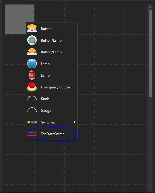
After adding it to the context menu this way, the end result should look like this:

It can also be created from a C# script (without adding it to the context menu), here is an example:

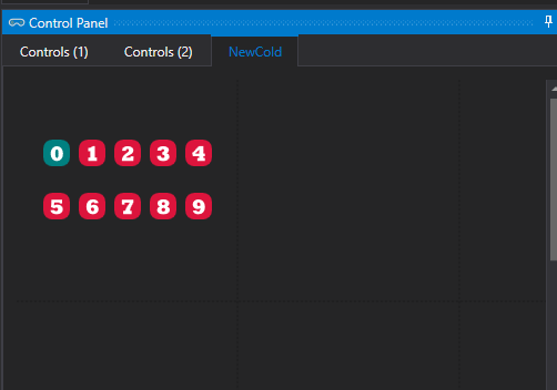
And lastly here is an example of an end result:

